Get in Touch

Australia GTM
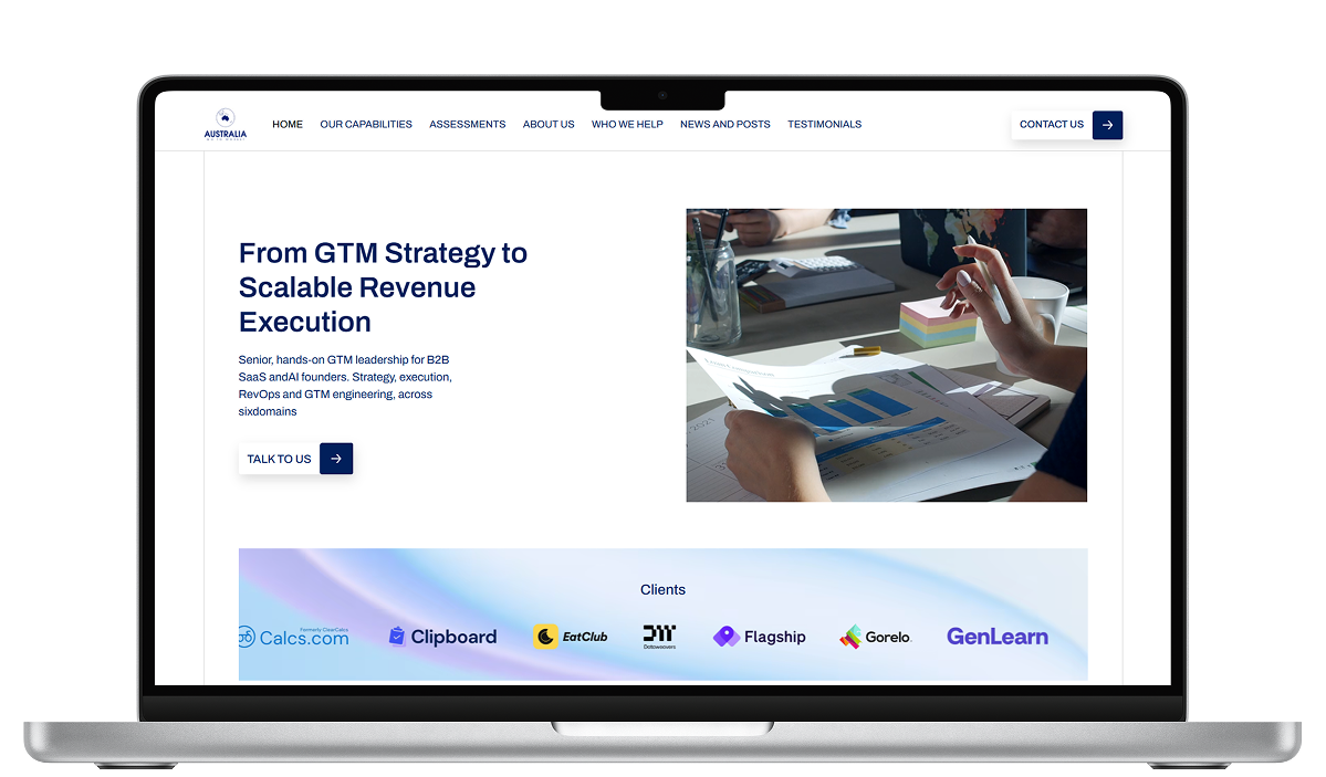
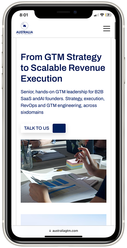
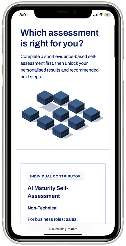
Design and Webflow development for a content-heavy GTM consultancy where scannability and load speed were the brief. We designed the site to present dense information in a way that's easy on the eye and quick to scan, then built it in Webflow with a content structure that makes self-managed updates straightforward, no developer needed for day-to-day changes.
Visit Website
9 pages · built in 10 days
Content-heavy site engineered to scan in seconds
Built for VCs & founders
The Challenge
Australia GTM had a lot to say. As a go-to-market advisory for founders and investors, their site had to carry dense, stat-heavy strategy content and the risk was obvious: a wall of text that a busy founder or VC would bounce from. The brief was clear-eyed. Make a content-rich site that loads fast and scans in seconds, looks credible to a sophisticated B2B audience, and means business, no fancy animation, no decoration for its own sake.
Our Approach
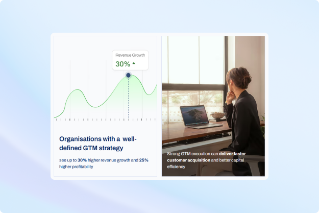
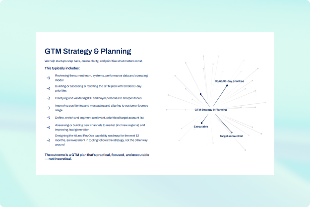
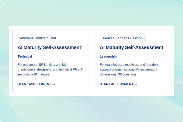
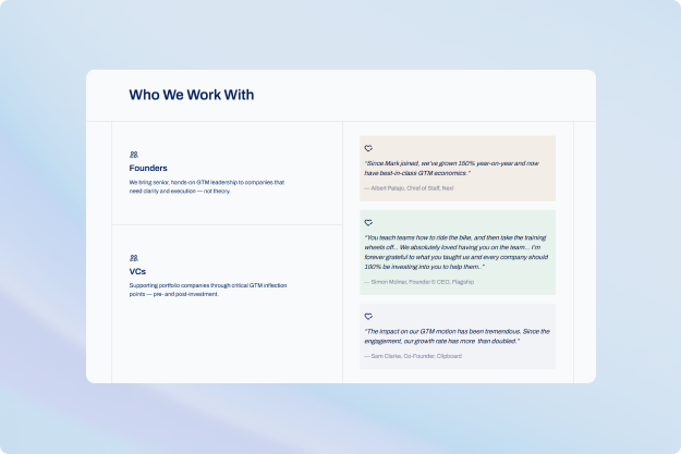
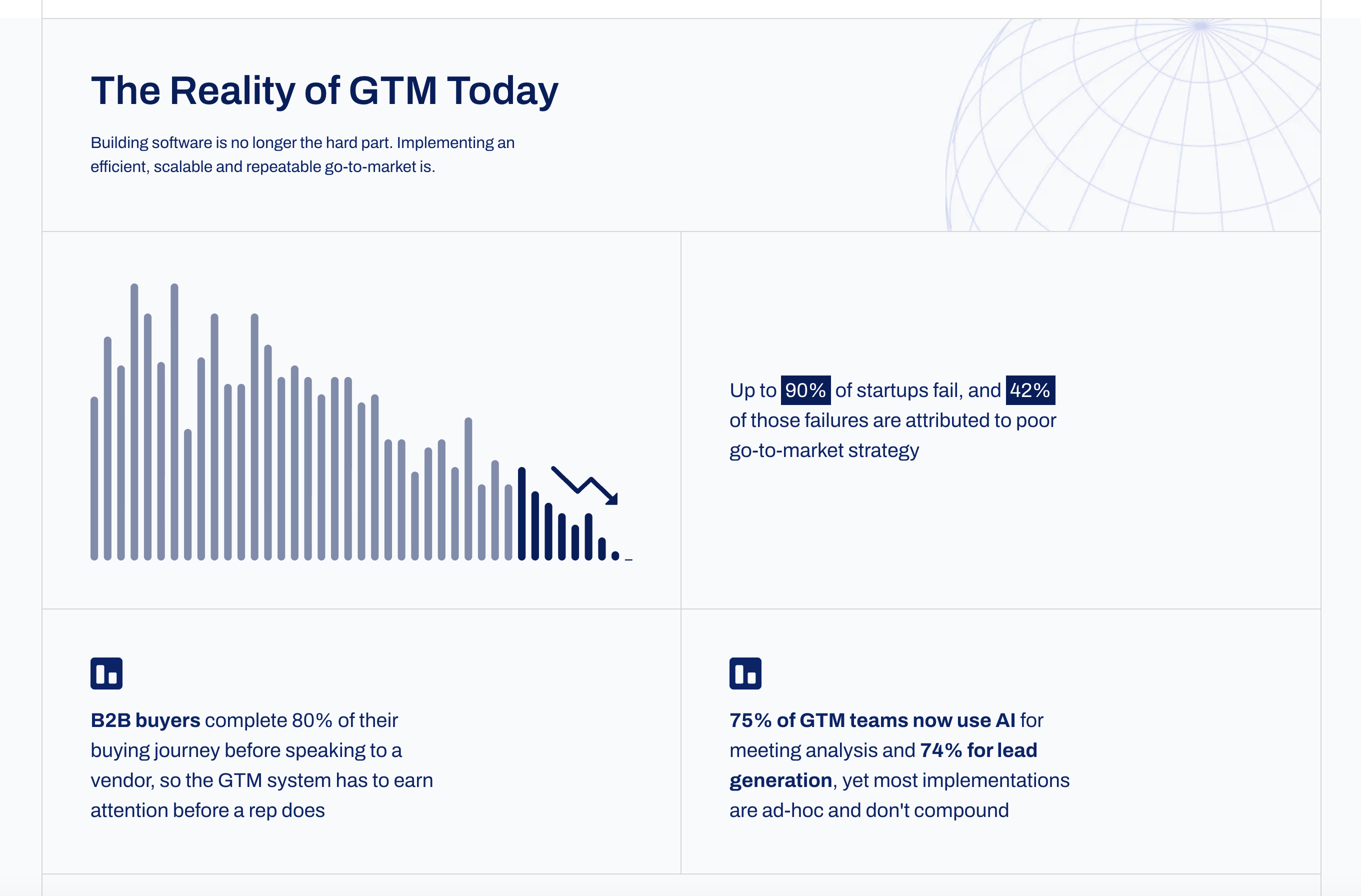
We treated this as a content-design challenge, not a decoration exercise. For an audience of VCs, founders, and GTM leaders, credibility comes from clarity, so we broke dense strategy content into scannable, digestible blocks: stat callouts, numbered frameworks, icon-led lists, and simple data visualizations that turn claims into proof. Every layout choice served readability and speed. We deliberately kept motion and styling restrained - professional, confident, and built to convert a serious buyer, not to show off.
The Build
- 9 static pages, designed and built in just 10 days.
- Content broken for scannability - stat callouts, numbered process steps, and "domains we work across" grids that let a busy reader absorb the message at a glance.
- Lightweight data visualizations to make GTM statistics tangible.
- Performance-first build - a content-heavy site kept fast and clean, with no animation weighing down load times.
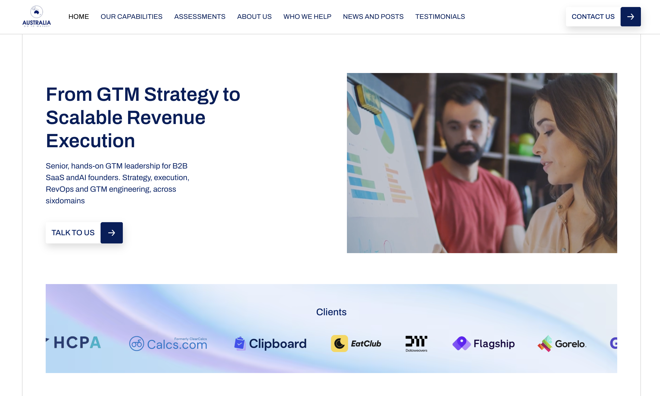
- Social proof, structured - a client logo strip and named testimonials placed to build trust at the right moments.
The Impact
Australia GTM launched in 10 days with a site that does exactly what its audience needs: communicates a dense, sophisticated GTM offering with clarity, speed, and credibility. The content is heavy but never feels heavy - every section is built to scan and the restrained, professional design signals seriousness to the founders and investors it's built for. Proof that good design isn't always about more; sometimes it's about making complex content effortless to absorb.
Featured Work

Design. Develop. Launch
Start your next big project with Skylar Studio, from concept to launch.